TechRadar Verdict
Solid hardware is only let down by a disappointing feature set
Pros
- +
Super mini QWERTY keyboard
- +
Wi-Fi
- +
Good Twitter and Facebook integration
- +
Top-mounted 3.5mm jack
Cons
- -
Not 3G
- -
Poor web browsing experience
- -
Average camera
Why you can trust TechRadar
Nokia's C3 is a companion to the recently launched, and well-received, C5 and a lookalike for the perennial favourite E72. But don't, for a single moment, labour under the illusion that it is a direct competitor for, or update of, the E72.
With an asking price of £119 direct from Nokia and as little as £80 elsewhere SIM free it's obviously a budget buy.
Our review sample came from Vodafone, where it costs £80 on PAYG. The E72 still costs over £250 SIM free by comparison.
The E series is definitely aimed primarily at the business community, though E handsets have found favour elsewhere. The C series is aimed at people who want a budget handset and also want good communications features, hence the mini QWERTY keyboard that adorns the front and built-in Ovi Maps and Ovi Chat.
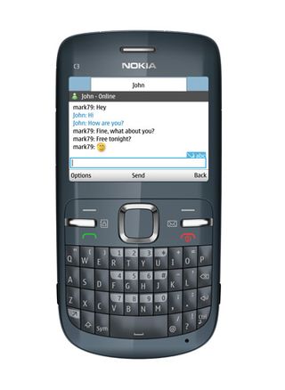
Facebook and Twitter feeds can be delivered live to the main screen, and Wi-Fi helps you keep a handle on data usage. You'll need that, actually, because this handset lacks 3G. You'll be relying on GPRS and EDGE for all your network based data comms.
The Nokia C3 comes in three colours. Our review sample was the slate grey option, which is really more blue than grey and a nice enough shade. There are also hot pink (eek!) and golden white versions.
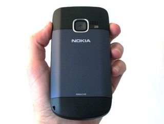
The outer shell is shiny and we found it rather attractive to greasy fingermarks. The back has a matt finish, which is easier to grip and less prone to smears.
The dominant feature of the Nokia C3 is its QWERTY keyboard, which occupies the bottom section of the front fascia. There is a good array of nicely-spaced buttons sitting above this.
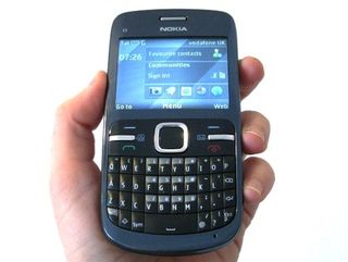
The D-pad is large and easy to use and there are two raised silver buttons. On our Vodafone-provided Nokia C3, the right-hand one can be customised immediately – you are walked through the process the first time you hit it.
The left-hand one takes you to Communities – a collective noun for Facebook and Twitter. More on that shortly.
Sitting inside these buttons on the flat fascia of the handset are two icons. You'll need to be precise, but pressing the one marked with the Messages icon took us to MyWeb (Vodafone's 360 service), while the other dropped us into Contacts.
There are also soft menu buttons and the Call and End buttons in this area, the latter doubling up as the on/off switch.
As is often the case, Nokia has made a very good job of the key quality and layout. We really find it difficult to fault.
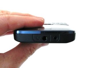
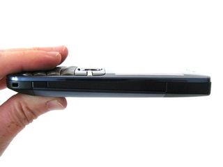
The sides are fairly minimal in terms of buttons and connectors, though the elements present are where you'd expect to find them. The 3.5mm headset connector sits happily on the top edge alongside the main power connector.
On the left side are mains power and PC connectors (micro-USB) and microSD card slot, both of which are protected by hinged covers. Towards the bottom of this edge is a quick release catch for the backplate.
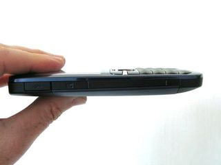
The right side is black apart from a second quick-release catch, and the bottom edge, which is rather more curved than the top edge, is also blank.
All is not sweetness and light, though. This isn't a small handset, yet the screen is compromised. The Nokia C3 measures 115.5 x 58.1 x 13.6mm and it weighs 114g.
With those dimensions you might expect more than a 2.4-inch screen – we think technically Nokia could have run to larger but the budget probably held things back. Delivering 320 x 240 pixels it is far from ideal for media-rich activities like web browsing.

I used to recommend this Fitbit Black Friday deal every year: it's finally gone, but here are some great alternatives

I simply can't stop recommending this iPad Black Friday deal

Want to save energy by identifying cold spots? This 5G rugged tablet has a thermal camera — and it's on sale at Amazon for Black Friday now
