Yes, the Nothing Phone (1) really can make mobiles fun again – here's how
Phones can be fun again and Nothing wants to lead by example

Although Nothing revealed most of the details surrounding its debut smartphone – the Nothing Phone (1) – ahead of its July 12 launch, one tidbit the company wasn't able to impart was just how exactly the phone intends to inject some fun back into the mobile market.
Throughout the Nothing Phone (1)'s journey to release, Nothing CEO Carl Pei and his company have repeatedly framed their debut smartphone as the antidote to a tired and unexciting smartphone landscape; populated by the same familiar names, pushing the same iterative upgrades. At the time of writing, both Nothing's and Pei's Twitter bios even recite their promise of 'making tech fun again.'
If you haven't yet read our Nothing Phone (1) review, three key elements of the device stand out that seem intentionally engineered to deliver on that sense of fun and joy that users have been promised.
Nothing OS' 'bubbles'
While Nothing granted interested fans early access to a version of the Phone (1)'s user experience in the form of a third-party launcher, ahead of the phone's release, using it natively on the Phone (1) is an unquestionably richer experience.

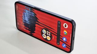
Circular elements, like the hybrid home screen folders – which let you store your favourite apps while granting quick access to the most important entries with a single tap – soften the underlying stock Android aesthetic.
You can even double-down on this look by enlarging single app icons too, which feels somewhat decadent on the phone's 6.55-inch Full HD+ display, but can be used in conjunction with those hybrid folders to create home screens littered with 'bubbles' of apps that are guaranteed to, at the very least, bring on the hint of a grin each time you unlock your Phone (1).
The transparent back's secret
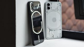
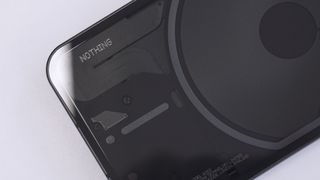
The biggest talking point of the Phone (1)'s design has to be its transparent Gorilla Glass back, under which you'll find a number of beautifully arranged components, dressed in a gamut of textures that play with the light differently.

From personal experience, fellow geeks seem to have a particular soft-spot for transparent technology; lusting after the Clear Blue Nintendo 64 console when it launched or clamouring to get a glimpse of the rare clear Pebble smartwatches that were occasionally spotted on the wrists of a few choice company employees.
It seems as though the team behind the Phone (1) share in this fascination for see-through gadgetry and in the process of designing their own smartphone, took the opportunity to offer a new generation of nerds some fresh eye-candy of their own creation.
Speaking with Ryan Latham, Nothing's general manager for the UK & Ireland, he also revealed to TechRadar that the hardware layout on the back of the Phone (1) harbours a secret – an elephant. See if you can spot it.
Everyone loves a light show
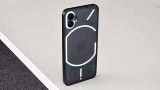
If you're being reductive, the Phone (1)'s signature Glyph Interface is little more than a glorified notification light, however, that's grossly underselling the sense of fun that the arrangement of 900 LEDs brings to the user experience.

Not unlike its transparent back, if you place your Phone (1) down at the bar with your friends and the lighting fires off, it's unquestionably going to garner attention and get people talking. The combination of light, audio and haptic patterns that kick in when you receive a call or a notification are far more exciting than the standard assortment of tones and notification icons that pop up on most phones.
Nothing (and design partners Teenage Engineering) share a love for the retro-futurist aesthetic that's evident in the Phone (1)'s software (namely the audio recorder, which features a tape reel visualisation) but beyond the glyph lighting and the camera flash, the back of the phone also plays host to a single red LED, whose only job is to blink when recording video, like an 80s VHS camcorder. Unnecessary? Yes. Appreciated? Absolutely.
During the Phone (1)'s launch, Pei expounded on the values of a team that designs the products it wants to see; not only making decisions based on market research and technological advancement but 'instincts' and that shows in the finished article that is the Phone (1).
The Nothing Phone (1) doesn't lead on specs or features like a conventional flagship but it's not trying to be one, it's trying to engage users in a way most phones fail to nowadays; with character, quirk and a bit of whimsy. There’s fun in the Phone (1), waiting for you to find.
Get the best Black Friday deals direct to your inbox, plus news, reviews, and more.
Sign up to be the first to know about unmissable Black Friday deals on top tech, plus get all your favorite TechRadar content.

Alex joined as TechRadar's Senior Phones Editor in June 2022, but brings over a decade's worth of experience to the role, with an expertise in smartphones, tablets and wearables. He's covered keynotes hosted by the biggest brands and attended the launches for some of the most influential mobile products of the last few years. His experience was amassed at some of the most reputable consumer technology publications out there, including GSMArena, TechAdvisor and Trusted Reviews.
Most Popular

